January's Color

Relentless Olive.png

We’re looking at the lighter things this New Year! So, we thought we would start off with Relentless Olive— a light green color. Olive’s color is known for its compassion, wisdom and acceptance. We think this color’s psychological meanings are perfect for the beginning year and we plan to take these few values into the rest of 2019 with us. Can you spot any olive tones this January? 

Have a peek at our Pinterest Board for some color inspiration!
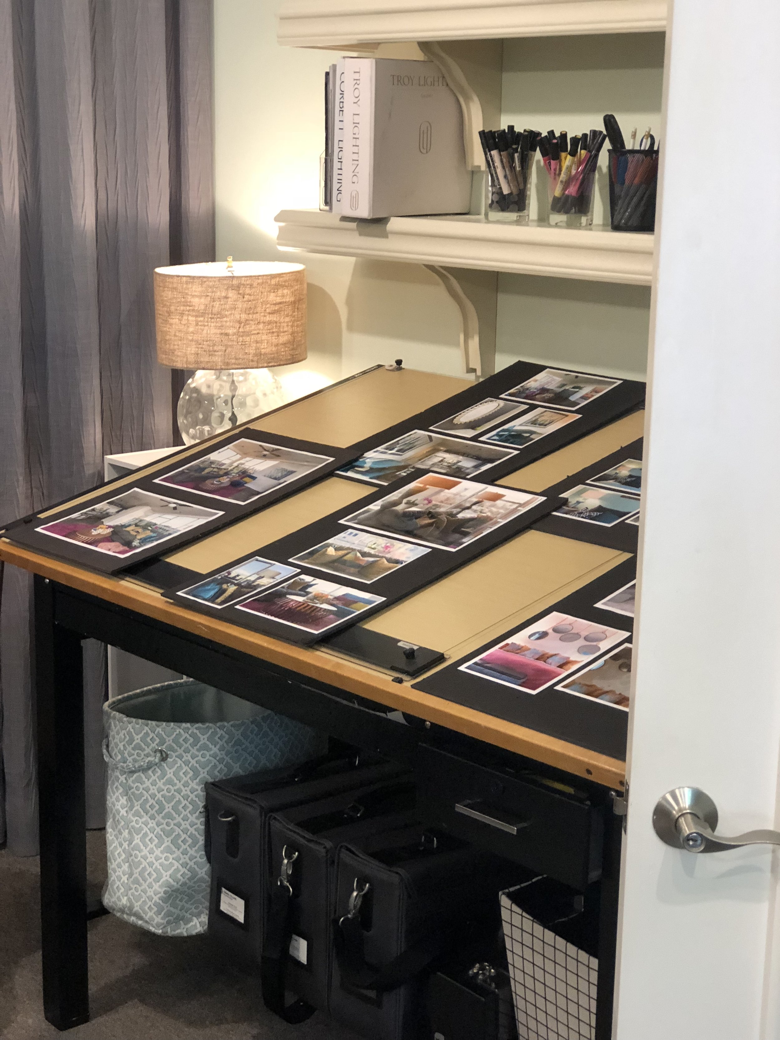
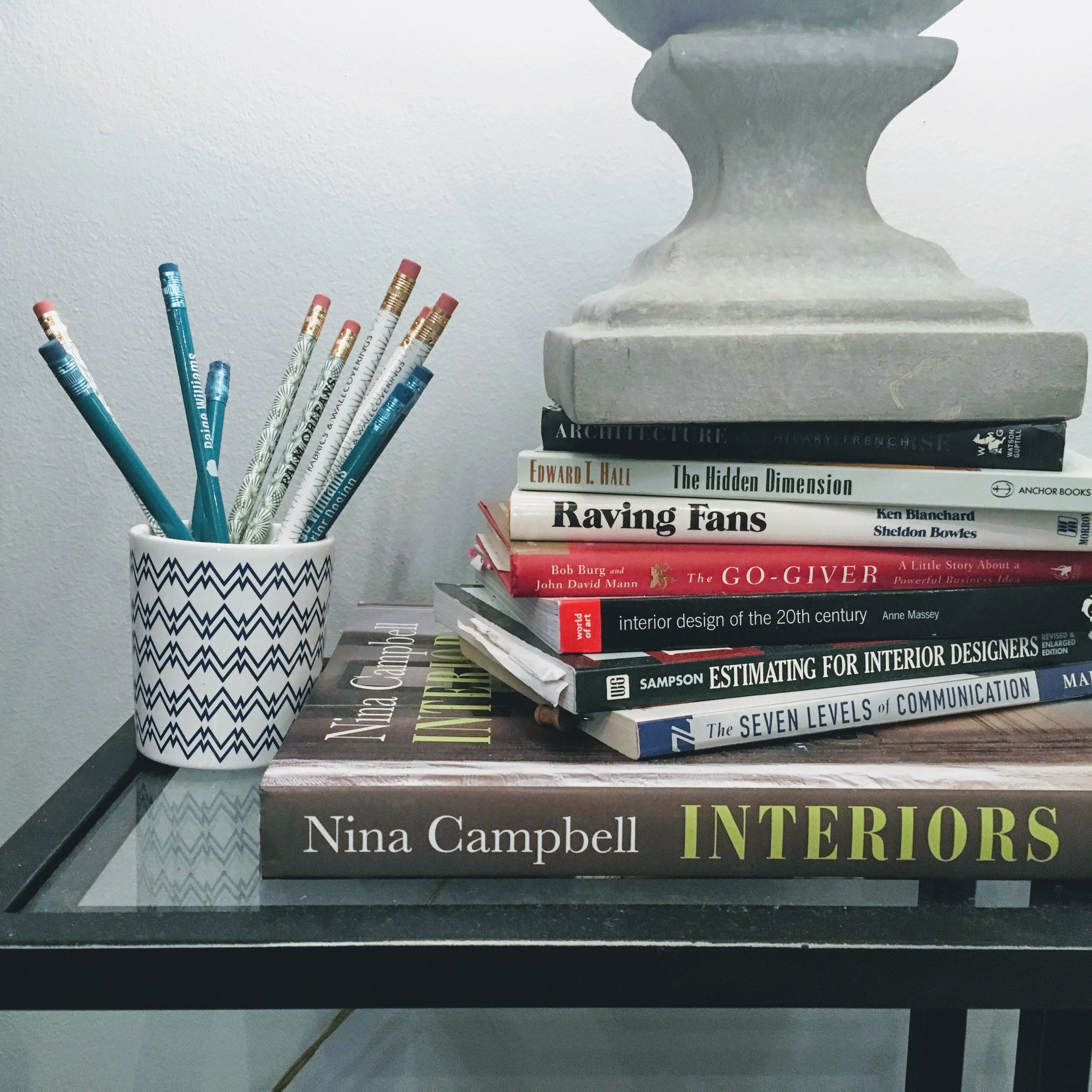
We are starting the year off with a clean desk and clear mind. Taking a moment to find our serenity in the many blessings we were offered last year. Looking forward to many more in 2019!
— Paige W Design Team

December's Color

Pure_Cashmere.png

For winter, we think of warm, inviting colors to keep us feeling cozy, so we initially pulled some neutrals like Pure Cashmere to show you this month. But as you well know, we don’t do neutral here at Paige Williams Interior Design! So instead, we decided to focus on the sparkle to spread the holiday cheer! That means December’s Color of the Month is Metallic! Gold, silver, rose gold, and anything and everything shiny and sparkly to keep the magic of the holidays going all month long!

VISIT OUR PINTEREST BOARD FOR COLOR INSPIRATION! 


Hi everyone!
We are all looking forward to the holidays and are crossing our fingers for some special snow days. See you next year!
— Paige W Design Team

November's Color

Harvest_Pumpkin.png

Hi everyone! We’ve chosen our color of the month to reflect our current season. Orange is known to be a controversial color, most people either hate it or love it, but when used correctly (we love it paired with a light blue) it can make magic! Orange combines the energy of red and the happiness of yellow. It stimulates the mind and it encourages activity. We all need warmer colors during these cold months! We can’t wait to spot our color of the month all around town this November!

VISIT OUR PINTEREST BOARD FOR COLOR INSPIRATION! 


Hello!
As we are nearing the close of 2018, we wanted to take a moment to give our thanks to each and every one of you. We couldn’t have had such an amazing year without you.
— Paige W Design Team

A Big Thank You!

Left to Right: Anna Palumbo, Madison Ferguson, Paige Williams, Brittany Creekmur, Jaclyn Henderson

Left to Right: Anna Palumbo, Madison Ferguson, Paige Williams, Brittany Creekmur, Jaclyn Henderson

78 Guests +

7 (client) Babies +

6 Dozen Roses +

5 Bottles of Champagne +

4 Dozen Mini Doughnuts +

300 Tortellini +

176 Pounds of Food for Second Harvest +

(Along with Many Other Contributing Numbers)

=

1 Very Successful Open House!!!


Paige Williams Interior Design + Tribe Interiors

would like to extend our sincere gratitude to all who supported us at our Open House on October 12th. You truly made this day a huge success for us and we are humbled by your thoughtfulness! Thanks to everyone who was involved in some way! We appreciate each and every single one of you!


IMG_20181017_142228_081.jpg

Along with the Open House accomplishment, we were also able to make a substantial donation (176 pounds of food to be exact!) to Second Harvest Food Bank due to your generosity.

And as a thank you for making those wonderful donations, we did a a giveaway for those who contributed to the charity.

And our prize winners are (drumroll please):

We will be in contact soon regarding the collection of your prizes!

We will be in contact soon regarding the collection of your prizes!


ls.jpg
Capture.JPG
one hope.JPG
cr=w_538,h_269.jpg

And another big thank you to these wonderful vendors! We hope that you enjoyed their cookies, wines, donuts, and coffees as much as we did!


We couldn’t have done it without you!
Thank you from all of us!
— Paige Williams + Tribe Interiors Design Teams

October's Color

Latigo_Bay.png

Latigo Bay is a calm teal color. Teal borrows its qualities from the two colors it borders on the color wheel, blue and green. This makes teal calm and tranquil but remains balanced due to its green properties. It can recharge your spirit in times of distress, making it perfect in a bedroom. Additionally, it can heighten levels of creativity and clear thinking, ideal for an office setting!  

VISIT OUR PINTEREST BOARD FOR COLOR INSPIRATION!


Hi everyone!
We believe Latigo Bay can be a contrast color or more of a monochrome color palette. We love layering these hues together to create a tranquil and imaginative space.

— Paige W Design Team